10 Questions with Andi Zhang
Al-Tiba9 Art Magazine ISSUE12 | Featured Artist
Andi Zhang is an architectural designer and a visual artist in the architecture field. She is now working at Kohn Pedersen Fox (KPF) as an architectural designer. She obtained her bachelor's degree from the Southern California Institute of Architecture (SCI-Arc), and her master's degree from the University of Pennsylvania. During her college, she took some classes not directly related to architecture, such as classes in visual expression, algorithms, philosophy, etc. It influences her to think of architecture in an abstract way and motivates her to create art pieces to show architecture in her eyes.
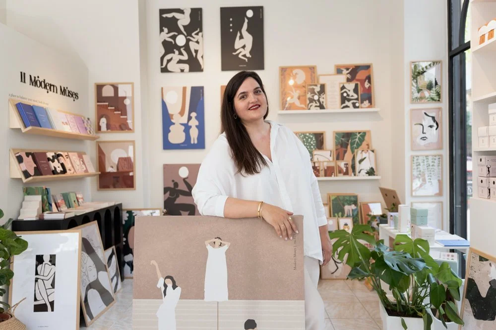
Andi Zhang - Portrait
ARTIST STATEMENT
Andi focused on using unconventional methods to dive into architecture. Instead of designing conventional independent buildings, she is trying to use other components to build up architecture, such as ground, water, air, light, and human view. She uses algorithmic ways to generate splitting, merging, and blurring components, resulting in a combination of different elements allowing for the mix of programs in an extended zone of civic space, where the boundaries between architecture and the environment are blurred.
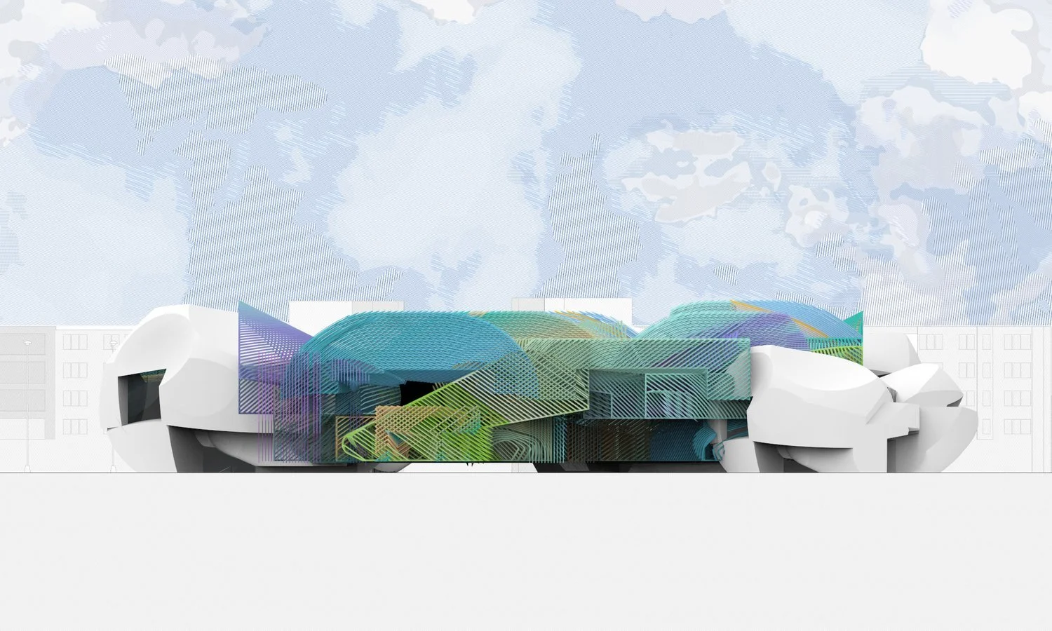
Vision (Texture), Digital Rendering, 36x74 inch, 2018 © Andi Zhang
Vision | Project description
By analyzing human's vision trajectory of space, an understanding of punctuation within form and vision is created to present a new definition of space.
This project is a narrative museum about Movies in Los Angeles. It is about analyzing the range of human vision and materializing it. To study punctuation within form and vision, using the color spectrum as a guide to define the space. A space from human vision is created by applying human vision cones and visitors' circulation. And colors are applied to create another depth of understanding of how those vision cones intersect.
Since it's a narrative museum, another method of understanding space is created, which is about movie screens. Anamorphic screens are arranged along vision cones. The movie presented on screens are distorted, but visitors can find a position in which movies are in a natural phase, non-distorted. On the way of looking for the best position for movies, visitors might dismiss those over-polychromatic visions around, thus creating a second way of understanding the space.
Vision (Axon), Digital Rendering, 42x36 in, 2018 © Andi Zhang
Get your limited edition copy now
INTERVIEW
First of all, how would you describe Andi Zhang in three words?
Active, ingenious, romantic.
You have a background in architecture and work as an architectural designer. How did you get interested in visual arts? And how does it influence your work as an architect?
I took a few classes about visual arts in college, and I found them fascinating. It is beautiful and powerful. It is also boundaryless: it doesn't have a limitation on tools and space; any kind of media can create visual art. And I found art is a unified language. By learning theory about visual arts, I better understand color and composition, which gives me a lot of help while working on visual work as an architect.
Vision (Plan), Digital Rendering, 42x24 inch, 2018 © Andi Zhang
In your biography, you recall taking classes outside of the architecture and design fields during college and that this inspired you to "think architecture abstractly." What does it mean to you? And how do you see art and architecture mixing and merging in your work?
It allows me to see outside of the architecture world, and also provides me with knowledge of theory and skills outside of the architecture field. Art gives me a broad way of thinking outside of traditional boundaries to create boldly. And architecture teaches me how to think analytically, and to be more rational.
Let's talk about your projects. What are the fundamental elements you always incorporate into your designs?
Nature elements such as ground, water, air, light, and architectural elements such as arcade, column, etc.
Vision (Site Plan), Digital Rendering, 42x24 inch, 2018 © Andi Zhang
Your statement mentions how you "use other components to build up architecture, such as ground, water, air, light, and human's view." How did you come up with this idea?
As an architectural designer, the normal elements I use every day are wood, concrete, and steel. And most of them end up constructing a box to contain people. It makes me think if I brought other elements that already exist around people, would the space be more organic? I also want to see if the layout of a building is not defined by walls but by the occupant's self-guidance. Will it end up with another type of space?
What do you aim to create with your work and your practice? Is there an ideal building or project you would like to develop?
My aim is to create work that contains a space suitable for occupants' habits. So I want to create a series of visual projects with ten participants, customize a space with their individual living routines and taste, and visualize in my method.
In your project Vision, you designed a narrative museum for movies in Los Angeles. What were your sources of inspiration? And what did you aim to create?
The inspiration for the project is a building called Villa Muller, designed by Adolf Loos. His idea is to design space instead of plan. "Storeys merge, and spaces relate to each other." I realize this idea could help me to release the constraint of a traditional architectural design routine, and matches my thought of designing spaces rather than rooms.
Vision (Elevation), Digital Rendering, 30x18 inch, 2018 © Andi Zhang
Vision (Elevation), Digital Rendering, 48x24 inch, 2018 © Andi Zhang
Let's define a "narrative museum." What is it for you? What are its uses, components, and characteristics?
It is a museum that has its own personality and story. The building is also the screen. Screens tell stories to guide visitors to finish the tour. And the experience of the building is embedded within the route when visitors look for the correct position of the screens. The building is composed of over-polychromatic lines, which use the shape of the human's vision range to build up the space experience.
Lastly, tell us about your plans. What are you working on? And what are your plans for the new year?
I'm currently working on a VR project. I hope it to be released in the new year.


![INTERVIEW | miguel costa [maarqa]](https://images.squarespace-cdn.com/content/v1/5a02e24901002767b723f9e8/1634049890411-HBJ6W7214JUNNRF6NGOU/Art_Magazine_Contemporary_Altiba9_Miguel+Costa_4B+Lesser+landscapes_installation_2021.jpg)


